Most mortgage broker websites do the same thing: list services, show a phone number, and hope visitors call. A small number of brokers have figured out something different - if you give visitors a reason to engage before they call, conversion rates go up significantly. Not because people are lazy, but because buying a mortgage is stressful and anyone who helps a visitor understand their options before asking for their details earns a different kind of trust.
A mortgage comparison and lead capture app is that reason to engage. Done well, it turns a passive website into a tool that qualifies leads, collects intent data, and hands your sales team a warm contact instead of a cold one.
Why Comparison Tools Convert
A visitor landing on a mortgage broker's site has a specific problem: they don't know what rate they qualify for, which product suits them, or whether the numbers work for their situation. Most sites answer none of these questions. They describe services in generic terms and ask the visitor to fill out a contact form - before they've seen any value.
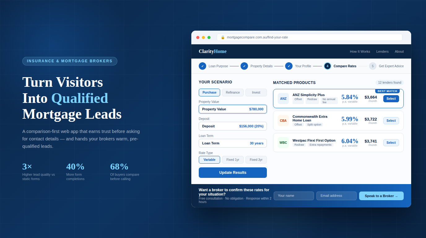
A comparison tool flips this. The visitor inputs their scenario - loan amount, deposit, income, property type - and immediately sees indicative rates and product options. They get something useful before you ask for anything. By the time they submit their details, they already know your tool works and your brokerage is worth talking to.
- 3× higher lead quality from interactive tools vs static forms
- 68% of mortgage seekers compare rates before contacting a broker
- 40% avg. increase in form completions with a comparison-first flow
The intent data is also valuable. A visitor who ran a comparison for a $650,000 loan at 80% LVR for an investment property tells your broker team a lot before a single call is made. That's a different conversation than a cold "I'm interested in mortgages".
What the App Needs to Do
Core Features
- Rate comparison engine - show indicative rates from multiple lenders based on user inputs
- Eligibility pre-screening - borrowing power calculator based on income, expenses, and deposit
- Product filtering - let users filter by loan type, rate type, offset, redraw, repayment flexibility
- Lead capture form - collect name, email, phone, and loan scenario after the user sees value
- CRM integration - push captured leads directly into your pipeline (HubSpot, Salesforce, or similar)
- Email follow-up trigger - send a personalised summary of what the user compared, with a CTA
What Separates Good from Bad
The difference between a comparison tool that converts and one that doesn't is usually not the rates - it's the experience. A tool that asks for an email before showing any results will see high abandonment. A tool that loads slowly, looks dated, or gives generic results will be dismissed.
| What Doesn't Work | What Does |
|---|---|
| Asks for contact details upfront | Shows results first, captures details after |
| Generic product descriptions | Scenario-specific rate and repayment breakdowns |
| Static "contact us" CTA | Contextual CTA tied to the comparison result |
| No follow-up logic | Automated personalised summary email post-submission |
| Mobile unfriendly inputs | Mobile-first input design with smart defaults |
Building the App: The Technical Flow
Frontend
Build the comparison interface as a multi-step form - not a single long page. Each step collects one piece of information and moves forward. This reduces cognitive load and increases completion rates:
- Loan purpose - Purchase, refinance, investment, construction. Sets the product filter context.
- Property and loan details - Property value, loan amount, deposit percentage, postcode. Drives the LVR calculation and lender eligibility.
- Borrower profile - Employment type, income, existing debts. Used for borrowing power estimate and pre-screening.
- Comparison results - Show matched products with indicative rates, monthly repayments, and key features. No contact details required yet.
- Lead capture - "Want a broker to confirm your options?" - name, email, phone. Submission triggers CRM entry and follow-up email.
Rate Data
You have two options for rate data. The simpler approach is a manually maintained rate table in your database - you or your team updates it when lender rates change. This works fine for smaller brokerages and keeps the comparison logic fully under your control.
The more sophisticated option is integrating a lender API or aggregator feed (Loanmarket, Connective, Aggregator portals) that pushes rate updates automatically. This requires more setup but ensures your comparisons are always current.
Important: Never present rates as guaranteed or final. Label all comparison results as indicative and include a clear disclaimer that actual rates depend on full assessment. This is both a legal requirement and a trust signal.
Lead Capture and CRM Integration
When a user submits their details, three things should happen simultaneously: the lead is created in your CRM with all the scenario data attached, a confirmation email goes to the user with a summary of what they compared, and your broker team gets an internal notification with the lead details.
The scenario data - loan amount, LVR, product preferences, borrowing power estimate - should travel with the lead record into your CRM. A broker opening a new lead should see the full picture immediately, not just a name and phone number.
Conversion Optimisation
The Follow-Up Email
The email sent after lead capture is one of the highest-leverage touchpoints in the flow. Most brokers send a generic "thanks for your enquiry" - which is a wasted opportunity. The email should reference exactly what the user compared: the loan amount, the rate they saw, the monthly repayment figure, and a specific CTA to speak with a broker about confirming those numbers.
Trust Signals Within the Tool
Visitors using your comparison tool are evaluating you while they use it. Small things matter:
- Lender logos - signals breadth of panel and legitimacy
- MFAA / FBAA membership badge - regulatory trust signal
- "Your data is secure" near the form - reduces privacy anxiety
- Broker headshot + name near CTA - puts a human face on the submission
- Live chat or callback option - gives hesitant users a lower-commitment path
Mobile
More than half of comparison tool sessions will be on mobile. Use large tap targets, numeric keyboards for dollar amounts, and progress indicators that work on small screens. A multi-step form that works beautifully on desktop but requires pinch-zoom on mobile will lose a significant portion of your traffic.
What to Measure
- Step completion rate - where in the multi-step form do users drop off?
- Comparison-to-lead conversion rate - of users who reach the results page, what percentage submit their details? Below 20% suggests the results aren't compelling or the CTA is weak.
- Lead-to-appointment rate - how many submitted leads convert to a broker consultation?
- Return visit rate - users who return after their first comparison session are high-intent.
Putting It Together
A mortgage comparison and lead capture app isn't a complex technical project - it's a focused product decision. The technology is straightforward. What takes thought is the flow design: what you ask and when, what you show before requesting contact details, and how the lead hands off to your broker team.
Brokerages that get this right end up with a website that generates qualified pipeline continuously, not one that sits dormant between paid ad campaigns.
Work with us: We build custom lead capture and comparison tools for mortgage brokers and insurance professionals. If you want a website that generates pre-qualified pipeline rather than cold enquiries, we've built these systems in production and know what converts.